
Choosing the right paint color can be transformative. It sets the mood, defines the atmosphere, and creates a cohesive aesthetic for your space. When it comes to selecting the perfect hue, navigating the world of color options can feel overwhelming. This article looks at green and blue-green paint colors, specifically Liveable Green and Sea Salt by Sherwin-Williams. Both have become immensely popular choices for modern interiors, but their subtle differences can significantly impact the overall feel of your space.
Understanding the Nuances of Green and Blue-Green
Green, the color of nature, evokes feelings of peace, growth, and renewal. Psychologically, green is associated with balance and harmony, promoting a sense of well-being. Blue-green hues, a beautiful marriage of green and blue, offer a calming and serene effect. They can create a sense of spaciousness and tranquility, making them ideal for bathrooms, kitchens, and bedrooms.
Option 1: Liveable Green
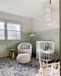
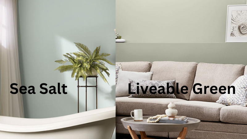
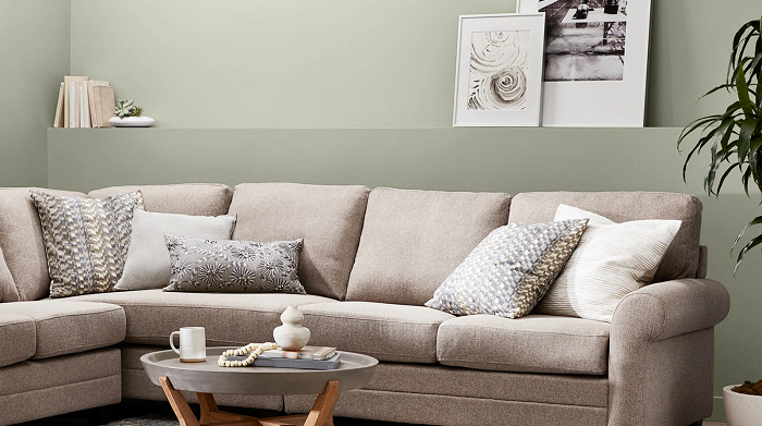
Liveable Green by Sherwin-Williams is a captivating light sage green with a touch of warmth. This versatile color strikes a beautiful balance between true green and yellow undertones. Under natural light, Liveable Green displays its verdant essence, creating a calming and inviting atmosphere. In spaces with warm incandescent lighting, the subtle yellow undertones emerge, adding a touch of warmth and richness.
Light Perception:
Liveable Green adapts beautifully to various lighting conditions. In rooms bathed in natural light, it retains its fresh, green character. Under cool artificial light, Liveable Green might lean slightly cooler, while warmer incandescent bulbs can coax out the yellow undertones, creating a cozier ambiance.
Ideal Applications:
Liveable Green’s versatility makes it a perfect choice for various spaces. It injects a touch of nature and tranquility into bedrooms, promoting a restful environment. In living rooms, Liveable Green creates a sophisticated yet inviting atmosphere, perfect for relaxation and social gatherings. It can also be a refreshing choice for hallways and entryways, setting a welcoming tone for your home.
Option 2: Sea Salt

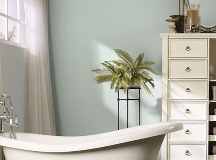
Sea Salt by Sherwin-Williams is an enigmatic color that has captured the hearts of many design enthusiasts. At first glance, it appears as a soft, calming blue-green. However, Sea Salt possesses a fascinating ability to transform under different lighting conditions. In rooms with abundant natural light, Sea Salt reveals its true blue-green nature, creating a sense of serenity and spaciousness. Under warm incandescent lighting, the green undertones of Sea Salt become more prominent, lending a touch of unexpected warmth. This chameleon-like quality makes Sea Salt an intriguing choice for those seeking a dynamic color experience.
Light Perception:
Sea Salt’s true beauty lies in its ability to adapt to varying lighting conditions. Natural light brings out its cool, blue-green essence, ideal for creating a spa-like atmosphere in bathrooms. However, under warm incandescent lighting, Sea Salt can surprise you by showcasing its green undertones, making it a surprisingly versatile choice for living rooms or kitchens. It’s crucial to consider the lighting conditions in your space when using Sea Salt to ensure the desired effect.
Ideal Applications:
Sea Salt’s calming and serene nature makes it a perfect choice for bathrooms, where it can create a spa-like retreat. In kitchens, Sea Salt’s versatility shines, offering a calming backdrop for food preparation and fostering a sense of spaciousness. For living rooms with abundant natural light, Sea Salt’s blue-green essence can create a tranquil and airy atmosphere. However, be mindful that under warm lighting, Sea Salt might lean more green, so consider this aspect if you have a specific vision for your living space.
Liveable Green vs. Sea Salt: A Comparison Table
| Feature | Liveable Green | Sea Salt |
| Color Base | Light, sage green | Green-blue blend |
| Undertones | Warm (yellow & gray) | Cool (blue) |
| Color Temperature | Warm | Cool |
| Light Reflection | High (makes space feel airy) | Lower (can absorb light) |
| Design Applications | Versatile (works across styles) | More specific (coastal & traditional) |
| Ideal Rooms | Living rooms, bedrooms, kitchens | Bathrooms, studies, south-facing rooms |
| Mood | Warmth, Invitation | Serenity, Calmness |
| Best with Natural Light | Any amount | Abundant natural light |
| Complementary Colors | Crisp white, beige, navy, terracotta | White, gray, blue, coral, yellow |
| Similar Colors (Other Brands) | Benjamin Moore’s “Gray Owl”, PPG Paints’ “Silver Strand” | Behr’s “Tranquil Blue”, Valspar’s “Coastal Breeze” |
| Accessories | Natural textures, botanical prints, terracotta | Seashells, driftwood, blue & white textiles |
Additional Considerations
- Liveable Green can make a small room feel larger due to its light reflectance.
- Sea Salt might require additional lighting in rooms with minimal natural light.
- Consider the overall design style you’re aiming for when making your choice.
Liveable Green vs. Sea Salt Key Differences
Now that we have a basic understanding of these colors, let’s explore the aspects that truly set them apart:
Color Temperature:
This is a critical factor when choosing paint. Liveable Green leans towards the warm side of the spectrum. Its yellow and gray undertones create a sense of warmth and coziness, perfect for living rooms, bedrooms, or even kitchens. Sea Salt, on the other hand, is a cool color. Its blue undertones evoke a sense of serenity and calmness, making it a good choice for bathrooms, studies, or south-facing rooms that get a lot of warm sunlight.
Light Reflection:
How a color reflects light significantly impacts the feel of a space. Liveable Green, with its lighter base, reflects light well. This can make a room feel more spacious and airy, particularly beneficial for smaller areas. Sea Salt, due to its cooler and potentially darker nature, can absorb light. While this can create a dramatic and intimate ambiance, it’s not ideal for rooms with limited natural light, as it might make them feel cramped.
Design Applications:
Liveable Green’s versatility shines through here. Its warm undertones make it a chameleon that blends seamlessly with various design styles. Whether you lean towards classic traditional, sleek modern, or cozy farmhouse, Liveable Green can adapt. It pairs beautifully with natural wood tones, crisp whites, and pops of bolder colors. Sea Salt, on the other hand, is a bit more specific in its application. Its cool, coastal vibe works best in rooms with abundant natural light. It complements nautical themes, creating a breezy and serene atmosphere. It can also add a touch of sophisticated charm to traditional settings.
Choosing Your Green Oasis:
So, how do you decide which green is right for you? Here are some key factors to consider:
- Desired Mood: Consider the feeling you want to create in the space. Liveable Green, with its warm undertones, fosters a sense of warmth and invitation. Sea Salt, with its cool tones, evokes a sense of serenity and calm.
- Natural Light: This plays a crucial role. If your room has limited natural light, Liveable Green’s light-reflecting properties will make it feel more spacious. Sea Salt might be too dark in such situations.
- Design Style: Liveable Green wins on versatility. It works across various styles. Sea Salt shines in coastal and traditionally-inspired spaces.
Beyond the Greens: Additional Tips for Success
Choosing the perfect paint color goes beyond just the shade itself. Here are some additional tips to ensure a successful outcome:
Sample, Sample, Sample:
This cannot be emphasized enough! Get paint samples of both Liveable Green and Sea Salt. Paint large swatches on your walls in different lighting conditions – natural light during the day and artificial light at night. Observe how the colors appear throughout the day and how they interact with your existing furniture and decor.
Consider Complementary Colors:
Don’t forget about trim and accents! Liveable Green pairs beautifully with crisp white trim for a timeless look. You can also experiment with warmer beiges or bolder accents like deep navy or terracotta. Sea Salt complements white trim for a coastal vibe. Lighter grays or blues can enhance its cool tones, while pops of coral or yellow can add a touch of vibrancy.
Exploring Similar Shades:
If you’re still undecided, here are some colors from other paint brands that offer similar vibes:
- For a color similar to Liveable Green, consider Benjamin Moore’s “Gray Owl” or PPG Paints’ “Silver Strand.”
- For a Sea Salt equivalent, explore colors like Behr’s “Tranquil Blue” or Valspar’s “Coastal Breeze.” Remember, these are just suggestions, and it’s always best to test samples in your specific space.
Living with Your Green Choice:
Once you’ve made your decision and painted your space, there are a few things to keep in mind:
- Accessorize: Artworks, throw pillows, rugs, and other decorative elements can amplify the chosen green’s impact. For Liveable Green, bring in natural textures like woven baskets and jute rugs. You can also add pops of color with botanical prints or terracotta vases. Sea Salt can be complemented with seashells, driftwood accents, and woven textiles in blue and white hues.
- Embrace the Light: Since Liveable Green reflects light, maximize natural light by keeping windows uncluttered and using sheer curtains. For Sea Salt, consider installing dimmer switches to adjust the ambiance and using strategically placed mirrors to bounce light around the room.
- Don’t Be Afraid to Experiment: Interior design is an ongoing process. If you find Liveable Green is a bit too warm for your taste, consider adding cooler-toned throw pillows or artwork. Conversely, if Sea Salt feels a touch too cool, introduce warmer elements like wood accents or woven rugs.
The Verdict
Liveable Green and Sea Salt, while both beautiful shades of green, offer distinct personalities. Liveable Green, with its warm embrace, is a versatile choice for various rooms and design styles. Sea Salt, with its cool serenity, creates a calming and sophisticated atmosphere, particularly in rooms blessed with abundant natural light.
Ultimately, the perfect green for you depends on the mood you want to create, the amount of natural light in your space, and your personal design preferences. When you understand the key differences between Liveable Green and Sea Salt, you can confidently select the green that will transform your space into a haven that reflects your unique style.
Remember: There’s no right or wrong answer when it comes to paint colors. Trust your instincts, experiment with samples, and have fun creating your green oasis!