
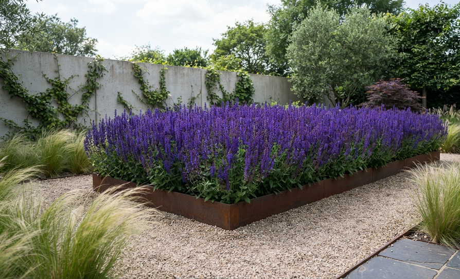
Your garden has twelve different flower colors fighting for attention, three “accent” plants that don’t match anything, and somehow it still looks messy even though you spent all weekend weeding. Sound familiar?
I used to think more color meant more impressive. My first real garden looked like a paint store exploded in it. Hot pink zinnias next to orange marigolds next to purple salvia, all competing for the same six square feet. Guests didn’t compliment my garden. They just kind of squinted at it.
Minimalist color palettes fixed that problem for me almost overnight. When you limit your plant colors the same way a designer limits colors in a logo, everything suddenly looks intentional instead of accidental. You don’t need more plants. You need fewer colors, chosen on purpose.
Here are seven palette combinations I’ve actually used, torn out, replanted, and eventually gotten right. I’m including what worked, what flopped, and the exact plants I’d use if I were starting your garden from scratch today.
Why a Limited Color Palette Actually Works Better
Before the list, here’s the quick reasoning, because I think it matters.
A garden with one or two dominant colors reads as calm from across the yard. Your eye doesn’t have to work to figure out what it’s looking at. This is the same principle behind why a single-color bouquet from a florist looks expensive while a mixed grocery-store bunch looks, well, like it came from a grocery store.
Limiting color also makes maintenance genuinely easier. When you’re only working with a couple of color families, replacing a dead plant is simple. You’re not hunting for “something else that’s kind of coral-ish” to fill a gap. You just grab another plant from your existing palette and pop it in.
I’ve also found that limited palettes photograph better, which matters more than people admit. If you’re the type who takes garden photos for Instagram or just for your own phone album, a two-color garden looks polished in every single shot. A rainbow garden needs perfect lighting and a great angle to look good, and even then it’s a coin flip.
1. All-White Moon Garden
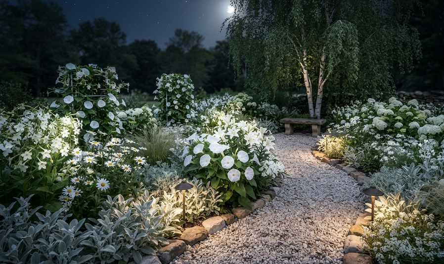
This is the palette I recommend to almost everyone starting fresh, because white gardens are nearly impossible to mess up.
White flowers glow at dusk and under moonlight, which is where the “moon garden” name comes from. If you’re someone who’s actually home to enjoy your yard in the evening rather than at high noon, this palette pays off in a way daytime colors never will. I planted a small white bed along my back fence specifically because that’s where I sit with coffee in the morning and wine in the evening, and it looks good at both times of day.
Good plants for this look include white coneflower, Shasta daisies, white cosmos, and moonflower vine if you want something climbing. For structure, white hydrangea gives you a big, reliable shrub anchor that doesn’t need replanting every year. Baby’s breath fills in gaps without stealing focus, which is exactly its job.
The mistake I made the first time was assuming “white” meant I could throw in anything labeled white and call it done. Not every white is the same white. Creamy whites, stark whites, and slightly green-tinted whites can clash more than you’d expect when they’re planted side by side. Now I actually hold plant tags next to each other at the nursery before buying, which feels a little obsessive but saves me from a mismatched bed.
One thing that surprised me: white gardens attract more moths and nighttime pollinators than colorful ones. If you like sitting outside in the evening, this is a bonus. If you don’t love bugs near your face while you relax, it’s worth knowing before you commit.
2. Blue and Silver Coastal Palette
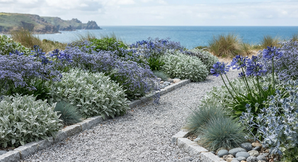
Blue is the rarest color in the plant world, so a garden built around it instantly looks curated rather than random.
I built a blue-and-silver bed a few years back after visiting a friend’s coastal-style yard, and it remains one of my favorite spaces I’ve ever planted. Russian sage, salvia, and lavender give you the blue-purple range, while lamb’s ear and artemisia bring in the silver foliage that ties everything together even when nothing is blooming.
The silver foliage part is the piece people skip, and it’s the piece that makes this palette work. Blue flowers alone can look thin and scattered because true blue blooms tend to be smaller and less dense than, say, a daisy or a rose. Silver leaves fill the visual gaps and give your eye somewhere to rest between flowers.
This palette does best in full sun with well-drained soil, since most blue-flowering plants and silver-leaved plants are Mediterranean natives that hate wet feet. Keep that in mind if your yard tends to hold water after rain, because I’ve watched lavender rot in soggy clay soil more times than I want to admit.
A quick side note: catmint is an underrated filler for this palette. It blooms for months, cats genuinely do roll around in it (mine has flattened entire sections), and it bridges the gap between the silvery foliage plants and the true blue bloomers nicely.
3. Black and White Modern Contrast Garden
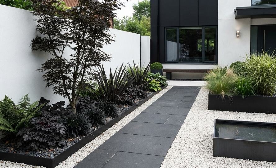
This is the palette for people who want their yard to look like it belongs next to a modern, minimalist house.
There’s no true black flower in nature, so “black” here means the deepest burgundy and near-black purples available, paired with crisp white. Black mondo grass is the workhorse plant of this look. It’s genuinely almost black, it’s low maintenance, and it works as a border, ground cover, or accent without ever needing to be babied.
Pair that dark mondo grass with white flowers like white petunias or white alyssum, and add a black-leafed elephant ear if you want serious height and drama. The contrast between the darkest foliage available and pure white blooms creates a graphic, almost architectural look that regular color gardens can’t touch.
I’ll be honest that this palette took me two failed attempts before I got it right. The first time, I used too much black and not enough white, and the whole bed just read as “dark and a little sad” instead of dramatic. The ratio matters here. I’d aim for roughly 30% dark plants and 70% white or light plants, which sounds backwards until you see it in person.
This palette also depends heavily on your house’s exterior. If you live somewhere with a lot of natural wood tones or warm brick, black and white can look jarring against it. It shines next to gray, white, or concrete-toned homes far more than it does against a warm-toned house.
4. Soft Pastel Pink and Sage Green
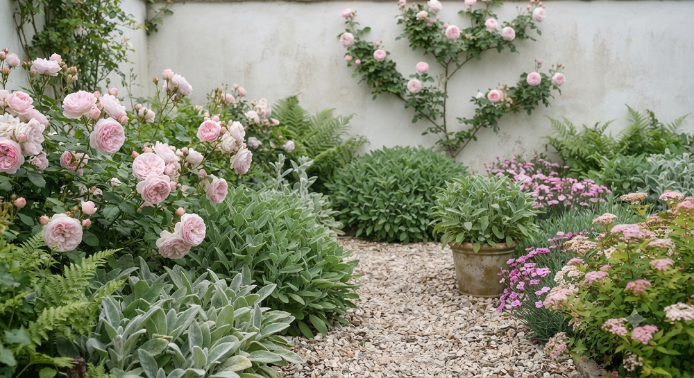
If stark contrast isn’t your style, this palette gives you softness without turning into a chaotic mixed-flower bed.
Blush pink roses, pale pink coneflowers, and dusty miller for silvery-green foliage make up the core of this look. Sage green isn’t just a filler here, it’s doing real work as the neutral that keeps the pink from feeling too sweet or too “little girl’s bedroom,” which is the risk with all-pink gardens.
This is the palette I’d recommend to someone who says they want their yard to feel “romantic” or “soft” without being able to explain exactly what that means. I’ve had readers describe this exact combination to me in emails, describing a vibe rather than specific flowers, and pastel pink with sage green is almost always what they were picturing.
The plants that work best here tend to be cottage-garden classics: soft pink peonies, blush-toned dahlias, and pale pink cosmos. Add ornamental sage or Russian sage for the green-gray tones, and you’ve got a palette that blooms in waves from late spring through fall if you stagger your plant choices by bloom time.
The one thing to watch is that pastel pinks fade fast in full, blazing sun. I planted a pink coneflower bed in a spot that gets eight-plus hours of direct sun, and by August, every bloom had bleached out to an almost-white version of itself. If your space is that sunny, either accept the fading as part of the look, or choose slightly deeper pink varieties that have more pigment to spare.
5. Gold and Terracotta Desert-Inspired Palette
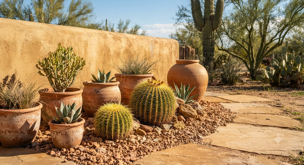
For hot, dry climates, or just for anyone who’s tired of babying thirsty plants, this warm palette is genuinely low-maintenance while still looking designed.
Yellow and orange might seem like an odd fit for “minimalist,” since we usually associate bold colors with maximalist gardens. But when you stick strictly to the gold-to-terracotta range and skip pink, purple, or blue entirely, it reads as a cohesive, sunbaked palette instead of a rainbow.
Black-eyed Susans, yellow yarrow, and orange butterfly weed form the backbone here, and all three are genuinely drought-tolerant once established, which matters if you’re trying to cut down your water bill or you just live somewhere hot. Ornamental grasses in warm tan tones add texture without introducing a new color that breaks the palette.
I planted this combination in the sunniest, most neglected corner of my yard, the spot where everything else had died on me at some point. It’s now the section that requires the least effort and gets the most compliments, which still feels a little unfair to the rest of the garden that I actually work hard on.
The tradeoff is that this palette looks a little sparse and sad in winter, since most of these plants die back completely rather than staying evergreen. If you want year-round interest, mix in an evergreen ornamental grass or ornamental grass with warm-toned seed heads that persist through the colder months.
6. Deep Green Monochrome Foliage Garden
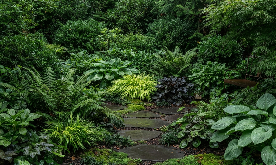
This is the palette for people who’ve realized flowers aren’t actually required to have a beautiful garden.
An all-foliage palette relies entirely on different textures and shades of green rather than blooms. Hostas, ferns, boxwood, and ornamental grasses all bring different leaf shapes and slightly different green tones, and the contrast between those textures does the visual work that flower color usually does in other gardens.
I’ve found that this is the most underrated palette on this entire list, and also the one people are most nervous to try because it sounds boring on paper. In person, a well-designed foliage garden looks lush, calm, and genuinely more sophisticated than a flower bed, especially in shaded areas where colorful flowers struggle to bloom anyway.
This palette is also the lowest maintenance option here by a wide margin. No deadheading, no worrying about bloom times overlapping correctly, and most of these plants are shade-tolerant, so you’re not fighting the sun for a good result. If you’ve got a shady side yard that’s never grown anything successfully, this is very likely your answer.
The one thing I’ll say honestly is that an all-green garden needs more attention to texture variety than a flower garden needs attention to color variety. If every plant has the same smooth, rounded leaf shape, the bed goes flat and boring fast. Mix broad hosta leaves with feathery fern fronds with the tight, structured look of boxwood, and the texture contrast keeps things visually interesting even without a single flower.
7. Single-Color Statement Bed (Pick One and Commit)
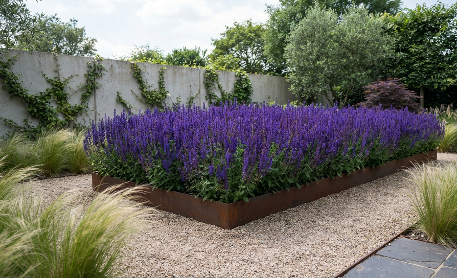
This is less a specific palette and more a strategy: choose one color, then use every shade and tint of that one color you can find.
An all-red bed, for example, isn’t just red roses. It’s deep burgundy dahlias, bright red salvia, rust-colored crocosmia, and a red-leafed Japanese maple as the anchor, all living in the same bed. The variation in shade keeps a single-color garden from looking flat, while the shared hue keeps it feeling unified and deliberate.
I did this with purple a few summers back, mixing deep violet salvia, lighter lavender-toned catmint, and a purple-leafed smoke bush for height and drama. It’s the boldest palette on this list, but it’s also, somewhat counterintuitively, one of the easiest to execute well, because you never have to think about whether two colors clash. They can’t clash with themselves.
This approach works especially well for a single, contained bed rather than your entire yard. I wouldn’t necessarily commit my whole property to one color, but a single statement bed by your front door, along a walkway, or framing a patio makes an incredible impact precisely because it’s unexpected in a small, contained dose.
Pick a color that already appears somewhere permanent in your landscape, like your front door, your house trim, or even your mailbox, and this palette will feel connected to your whole property instead of like a random bed someone dropped in the yard.
Real Talk: What Actually Goes Wrong With Minimalist Color Palettes
Here’s the part most garden articles skip, and it’s the part that actually matters.
“Minimalist” doesn’t mean “low effort” in terms of planning. Ironically, a limited palette takes more upfront thought than a mixed garden, because every single plant choice has to fit the theme. I’ve stood in nursery aisles for twenty minutes trying to decide if a specific purple was “my” purple or a slightly wrong purple that would throw the whole bed off. Give yourself more planning time than you think you need, not less.
Bloom times matter more than color in this style. If your entire white garden blooms in June and goes empty by July, you’ve got a “white garden” for four weeks and a plain green bed for the rest of the season. I learned this the hard way with my first pastel pink bed, which looked incredible for about six weeks and then sat there doing nothing for the rest of summer. Now I specifically choose plants within my palette that bloom at different times, so something is always going.
Foliage-only palettes need more upkeep than they get credit for. People assume an all-green bed is maintenance-free because there’s no deadheading. But hostas get slug damage, boxwood needs shaping, and ferns can look ragged by late summer if you don’t clean them up. It’s a different kind of work, not zero work.
Single-color beds show every flaw. When everything in a bed is the same color family, a dead plant, a bare patch, or a weed sticks out immediately, because there’s nothing else drawing the eye away from it. A mixed garden hides imperfections better than a minimalist one does. That’s a real trade-off, not just a minor detail.
Not every plant tag is accurate about mature color. I’ve bought “white” flowers that opened cream, and “blue” salvia that turned out closer to purple once established. Buy plants while they’re actually blooming whenever you can, rather than trusting the tag alone, especially for a palette where color accuracy is the entire point.
Parting Wisdom
The best minimalist garden I ever built wasn’t the most expensive one or the one with the rarest plants. It was the blue and silver bed, and it worked because I picked a palette I actually loved looking at every single day, then stuck with it instead of getting distracted by every pretty plant at the nursery.
Pick a palette that fits your climate, your house, and honestly your personality, and give yourself permission to leave the other ten colors you like at the store.
Which of these seven palettes fits your yard best, and what’s stopping you from trying it? Drop your answer in the comments below. I read every one, and I’m always happy to help you troubleshoot a specific plant pairing if you’re stuck.

About Syprose Kiche
Syprose Kiche is the creator and writer behind My Besuited Home, a practical home and garden website covering DIY projects, gardening, lawn care, landscaping, home improvement, and outdoor living. She focuses on turning everyday homeowner questions into clear, practical guides backed by careful research and useful real-world considerations.