
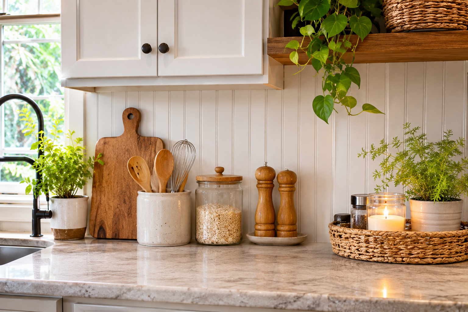
Two things tend to go wrong with backsplashes. The first is a pattern that fights the cabinets. The second is a material that can’t handle the wall behind the stove. Both mistakes usually start in a showroom, where a small sample looks calm under bright light and then turns busy across fifteen feet of wall.
So the useful question isn’t which backsplash is prettiest. It’s which one suits your cabinets, how much heat and moisture that stretch of wall takes, and how much cleaning you’re willing to sign up for. The eleven ideas below are organized around those questions. Each one notes which styles it suits (white cabinets, farmhouse, rustic) and where it tends to go wrong.
Four Questions That Narrow the Field Before You Look at Tile
How far up the wall will it go?
The standard backsplash zone is the strip between the countertop and the upper cabinets, which is typically about 18 inches. Running the material up to the underside of the cabinets is the usual choice. Behind a range, many people carry it up to the hood or ceiling, which turns the cooking wall into a focal point and protects drywall from the worst of the splatter. A 4-inch splash cut from the countertop material makes sense mainly where there are no upper cabinets.
What does that wall have to survive?
Behind the sink the main enemy is water. Behind the range it’s heat, grease, and steam. Everywhere else it’s fingerprints and the occasional splash. A material that’s fine beside the sink can be a bad idea behind the stove.
The range’s installation manual lists minimum clearances to combustible surfaces. Wood, MDF, and many plastics and vinyl products are combustible or heat-sensitive. Ceramic, porcelain, brick, natural stone, and metal are not. Read that manual before you fall in love with a material.
How busy are the other surfaces?
A good rule is that a kitchen gets one hero. If the countertop has strong veining, keep the backsplash quiet. If the countertop is plain, the backsplash can carry pattern or color. When both compete, the eye has nowhere to rest.
Does the sample match the actual cabinet?
White cabinets aren’t one color. Some lean warm, with a creamy or yellow cast. Some lean cool, with a faint blue or gray tint. Bright white tile beside a creamy cabinet makes the cabinet look dingy, and a warm cream tile beside a cool white cabinet can look muddy. Tape samples directly beside a cabinet door and look at them in morning light, evening light, and under your actual bulbs. Leave them up a few days. A color that looks right at 10 a.m. can look different at 7 p.m.
11 Backsplash Ideas, and What Each One Asks of You
1. White Subway Tile, With a Layout and Grout Choice That Give It Depth
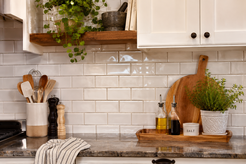
The 3-by-6-inch white subway tile earned its popularity because it’s inexpensive, easy to find, and neutral enough to sit beside almost any countertop. Its weakness, especially against white cabinets, is that it can read as flat: a white wall behind white doors with nothing to look at.
Three choices fix that. The first is layout. The offset brick pattern, called running bond, is the traditional look and the most forgiving. Stacking tiles in a straight grid feels cleaner and more contemporary. Turning them vertical pulls the eye upward, which can help a short wall or a low ceiling.
The second is the edge. A beveled edge catches light and creates a faint shadow line around each tile, which flat-edged tile lacks. The third is grout. Bright white grout makes the wall look seamless, but it also shows every drip of tomato sauce near the stove. A light warm gray, or a shade between the tile and the cabinets, hides more and outlines the pattern.
Size matters too. Longer tiles, such as 4 by 12 inches, mean fewer grout lines to scrub. This is a conservative choice that works in white and farmhouse kitchens alike. The risk is blandness, and the three choices above are how to avoid it.
2. Zellige or Handmade-Look Tile for Soft, Uneven Light
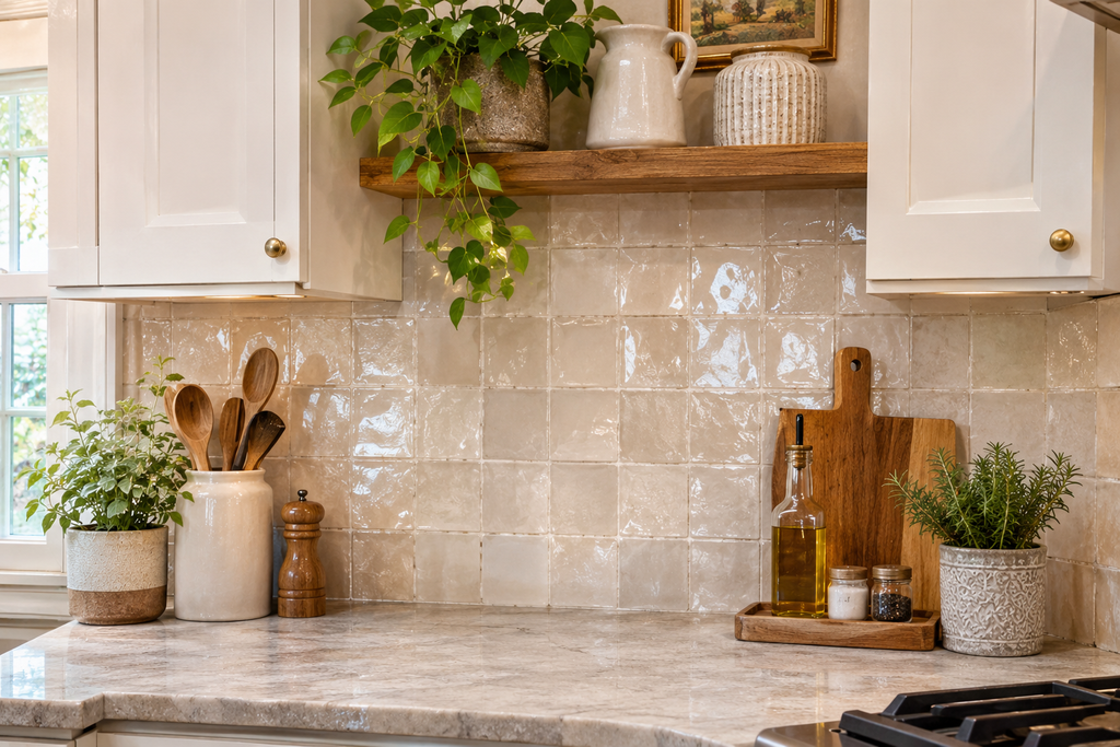
Zellige is a handmade Moroccan clay tile, glazed by hand, which is why no two pieces match exactly. Edges wander, surfaces dip slightly, and color pools and fades from tile to tile. On a white or cream kitchen it looks soft and almost watery, closer to a plastered wall than a printed grid. Farmhouse kitchens suit it especially well, because the imperfections echo other handmade things in the room: stoneware, a wooden bowl, a plank table.
The trade-offs are real. Because the tiles vary in thickness, installers typically leave wider grout joints and work harder to keep the surface reasonably even, so labor often costs more than for machine-made ceramic. Under-cabinet lighting that skims across the wall exaggerates every dip. Some people love that and others find it distracting. Ask to see a full installed wall, not a single tile, before ordering.
Also ask the supplier about sealing and cleaning. Glaze and exposed clay edges differ between makers, so follow their guidance rather than a generic rule.
If the budget doesn’t stretch, many manufacturers sell machine-made ceramic with a deliberately wavy surface and varied glaze. It won’t match the depth of the real thing, but it gets much of the effect for less money. White, cream, pale clay, and soft sage are the colors that work best with white cabinets.
3. Beadboard or Tongue-and-Groove for a Farmhouse Wall That Isn’t Tile
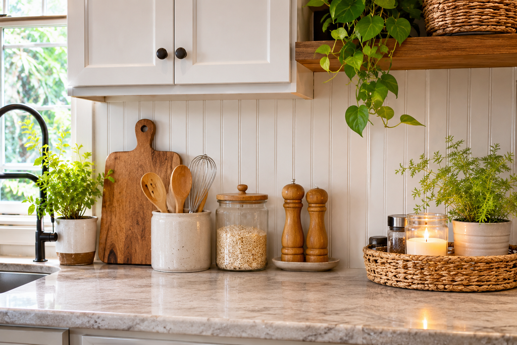
Beadboard, with its narrow vertical planks and rounded grooves, is the farmhouse backsplash for people who want cottage warmth rather than tile. It works best on walls that don’t take much cooking heat: a coffee station, a baking nook, the wall beside the sink, or a breakfast area where the kitchen opens into a dining space.
The material decides whether it lasts. Real wood and MDF both absorb moisture, and MDF in particular swells when water gets behind a seam or at the bottom edge. PVC or vinyl beadboard panels shrug off water and wipe clean more easily, though some are heat-sensitive. Whatever it’s made of, paint it with semi-gloss or satin enamel, caulk the seams and the joint at the counter, and wipe up splashes instead of letting them sit.
Don’t use it behind a range or cooktop. A practical compromise is to tile the cooking zone with a panel about as wide as the range, then use beadboard everywhere else. Finish the transition with a trim piece so the edge looks intended rather than improvised.
One more limit: the grooves collect grease and dust, so beadboard is harder to wipe than a flat surface. It suits kitchens where the cooking is light, or where a soft brush now and then doesn’t sound like a burden.
4. Brick for Rustic Kitchens That Want Texture
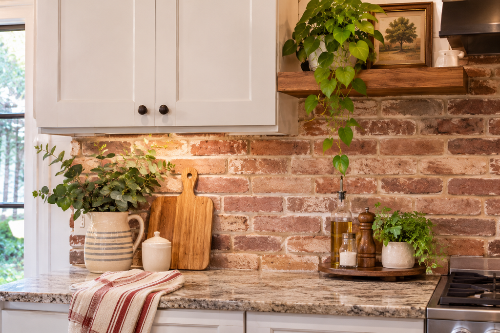
Brick delivers warmth and irregularity that’s hard to get from tile. That makes it a natural fit for rustic kitchens with wood beams, butcher block, or dark counters. Against white cabinets, it supplies the earthiness an all-white kitchen can lack.
There are four versions to choose from:
- Real exposed brick is the genuine thing, but you can only use it if the house already has it.
- Thin brick veneer is sliced from real brick or fired as thin units, typically well under an inch thick, and installed like tile. It’s the practical way to add brick to a kitchen without structural support.
- Brick-look ceramic or porcelain imitates the look with far less porosity.
- Painted or whitewashed brick softens the red for white or light kitchens.
Porosity is the issue to plan around. Unsealed brick and mortar soak up grease and stains, and once that happens it’s hard to remove. A penetrating masonry sealer suited to kitchen use helps, and the product’s label will say how often to reapply.
Salvaged brick needs extra care. Old brick can carry soot, dust, or old paint, and paint in older buildings may contain lead. Clean it thoroughly, seal it, and test it if you don’t know where it came from. Brick is non-combustible, so it’s fine behind a range, but expect more scrubbing than with glazed tile.
5. Marble, Marble-Look Slab, or Veined Tile for White Cabinets
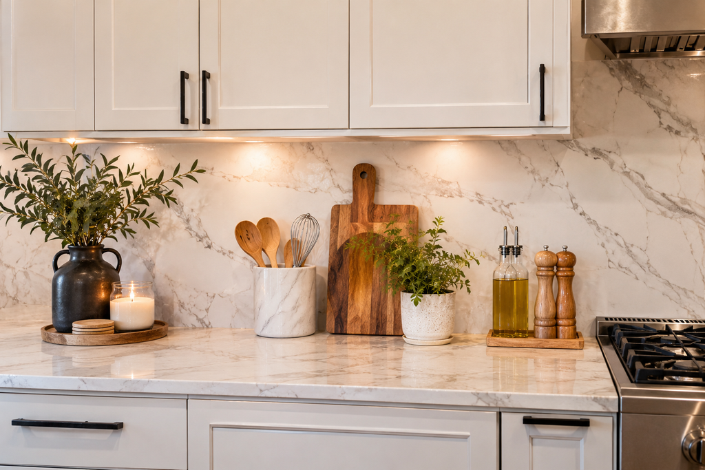
A marble backsplash suits white cabinets because soft gray veining adds movement without introducing another color. Carrara tends toward softer gray veining on a white or pale gray ground. Calacatta is generally bolder and more dramatic.
Marble is a soft, calcium-based stone that reacts with acids. Lemon juice, vinegar, tomato sauce, and wine leave dull spots called etching. Etching is damage to the surface itself, not a stain, and sealing doesn’t prevent it. Sealer only slows absorption of oils and liquids. A honed (matte) finish hides etching better than a polished one. Wipe splashes quickly, and use a pH-neutral stone cleaner rather than vinegar-based sprays or abrasive powders.
A slab backsplash runs as a single piece from counter to cabinet, which removes grout lines and makes cleaning easy. It needs a fabricator to template and cut around outlets, and the veining should be planned so it flows from the counter into the wall.
If real marble sounds risky, porcelain slabs and quartz patterned like marble give a similar look with less maintenance. One caution on quartz: its resin binder can be damaged by high heat. Check the manufacturer’s guidance before running it behind a cooktop.
6. Herringbone, in Whatever Material Matches Your Style
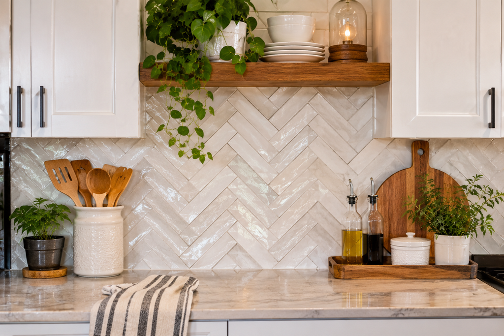
Herringbone sets rectangular tiles at angles to form a zigzag, like the weave in tweed. It adapts to all three styles depending on the tile. Small white ceramic suits white kitchens. Matte cream or pale gray works in a farmhouse kitchen. Brick-red or wood-look planks give a rustic result.
It costs more in labor and waste than a straight layout, because every edge tile has to be cut. Many installers recommend ordering roughly 15 to 20 percent extra for diagonal or herringbone patterns, compared with about 10 percent for a straight lay. Confirm the number with your installer.
Plan the pattern from a centerline, usually the range or hood, so it looks symmetrical where the eye lands. Dry-lay a section on the floor to see how the pattern will end at the cabinets and outlets.
The pattern already supplies visual energy, so keep the grout close to the tile color. Strongly contrasting grout turns the wall into a busy lattice. Keep the rest of the kitchen quiet too, with plain counters and simple hardware. For most people this is a job for a professional. A confident DIYer is better served by a straight or offset layout.
7. Black or Charcoal Tile Against White Cabinets
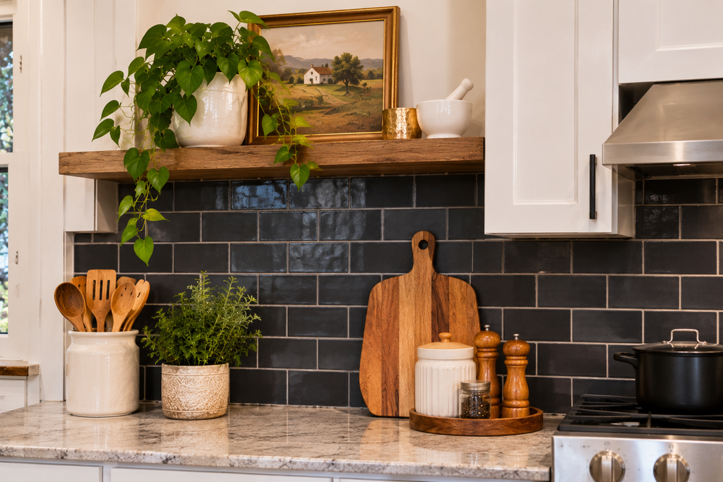
Pairing white cabinets with black or deep charcoal tile is the high-contrast route. It’s crisp and graphic, and it looks very different from the usual soft farmhouse palette. An industrial-leaning farmhouse kitchen with black hardware and open shelving suits it well.
It works best where there’s decent natural light, because dark surfaces absorb light and can make a small or windowless kitchen feel tighter. LED strips under the upper cabinets help offset that.
Finish matters more than color. Glossy black shows water spots, fingerprints, and dust. A matte or honed finish is more forgiving. Grout is the other decision. White grout against black tile makes a heavy grid. Charcoal or black grout, or one close to the tile, keeps the surface calm. Dark cement-based grout can show uneven color over time if it isn’t sealed, while epoxy grout holds color more consistently. It’s harder to work with, so it’s best left to an experienced installer.
Matte black subway tile, slate-look porcelain, and black hex tile are the common choices.
8. Patterned Cement-Look Tile as a Panel Behind the Range
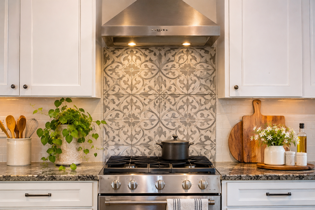
Patterned tile, whether geometric or floral, brings color and personality to white and farmhouse kitchens. The best way to use it is restrained: a panel behind the range, about as wide as the range or hood (30 inches is common), framed by plain white or neutral tile across the rest of the wall. Think of it as a rug for the wall. The pattern becomes the focal point without taking over the room.
True encaustic cement tile is made by pressing pigmented cement into a mold, and it’s porous. It needs sealing before and after grouting, and it develops a patina over time, which some people love and others don’t. Cement-look porcelain prints the pattern on a dense, nonporous body and is much easier to maintain, which makes it the more practical route for most kitchens.
Check the pattern’s repeat before ordering. A large motif on a narrow panel can get cut mid-flower at the edges. Center the pattern on the range, and order extra tile because pattern cuts create more waste. Keep the countertop plain, so the panel is the only thing asking for attention.
9. Wood Planks or Wood-Look Tile for Rustic Warmth
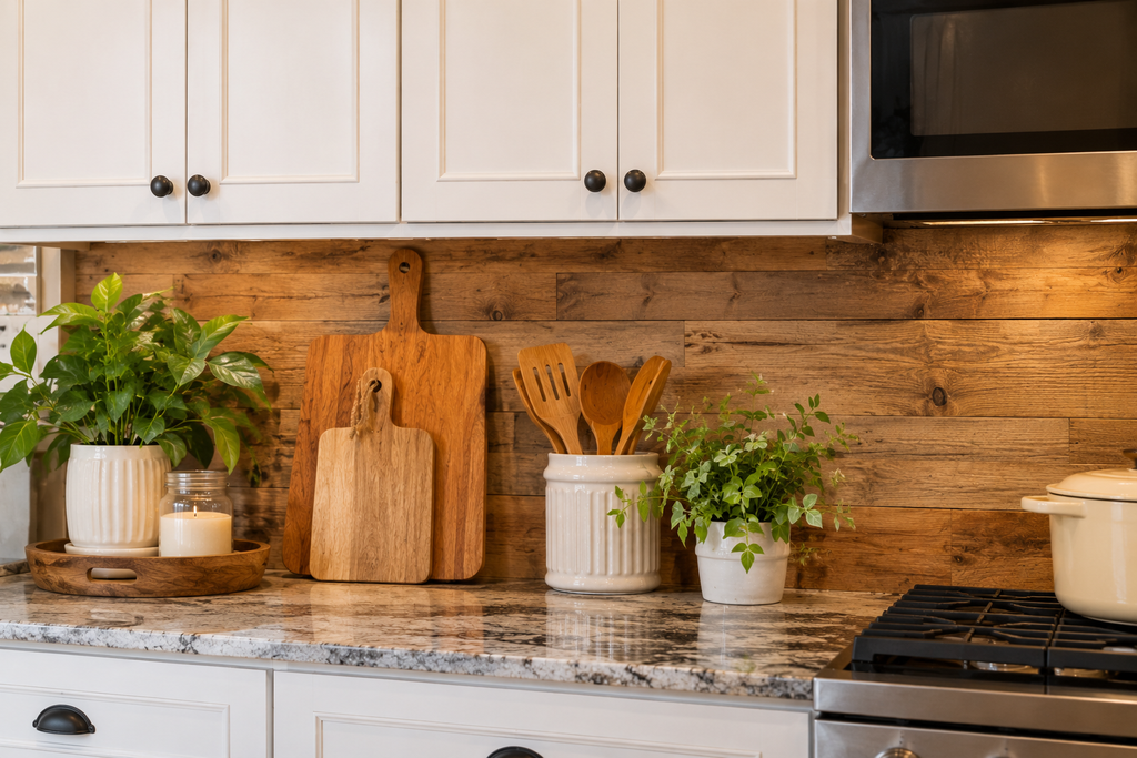
Wood planks are the obvious rustic move, and the real question is whether to use real wood or wood-look tile.
Real wood belongs on walls away from the sink and stove: an open-shelving wall, the back of a breakfast bar, or a hood surround. It needs a durable sealed finish, it moves with humidity, and it’s combustible, so it stays well clear of the cooktop. Reclaimed barn wood needs thorough cleaning, and old finishes on salvaged boards may contain lead, so test unknown sources before sealing and installing.
Wood-look porcelain plank tile gets the texture without those limits. It’s water-resistant, non-combustible, and easy to wipe, and it can go right behind the range. Look for a line with multiple printed face patterns, and mix boxes while laying so the same knot doesn’t repeat. Keep grout joints narrow and close in color so the surface reads as boards.
Horizontal planks make a wall look wider. Vertical planks emphasize height. A mix of plank widths gives a more authentic reclaimed feel. Against white cabinets, gray-brown or mid-tone planks tend to look weathered, while very orange-toned planks can clash with a cool white.
10. Muted, Glossy Color: Sage, Dusty Blue, or Soft Clay
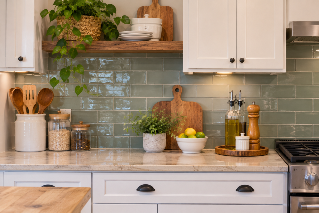
A muted color is one of the easiest ways to give a white kitchen personality without making the room feel busy. Sage green, dusty blue-green, and soft clay all sit comfortably in a farmhouse kitchen. Handmade-look glazed ceramic adds subtle variation in tone from tile to tile, which keeps the color from looking flat.
Mid-tone colors also have a practical advantage. They tend to hide drips and splashes better than pure white or black. Glossy glaze bounces light around the room and is easy to wipe, which suits a wall that takes frequent cleaning.
Because tile is permanent, choose a color that can outlast trends. Muted, slightly grayed tones age better than saturated ones. Pick a color that already appears elsewhere in the house, such as in flooring, a rug, or a painted piece of furniture, so it feels connected. Sage pairs well with brass or aged-bronze hardware, and dusty blue works with black or nickel finishes. Sample the tile beside your actual cabinet door and countertop, because glaze colors shift under different bulbs.
11. Copper or Stainless Steel for an Industrial-Rustic Edge
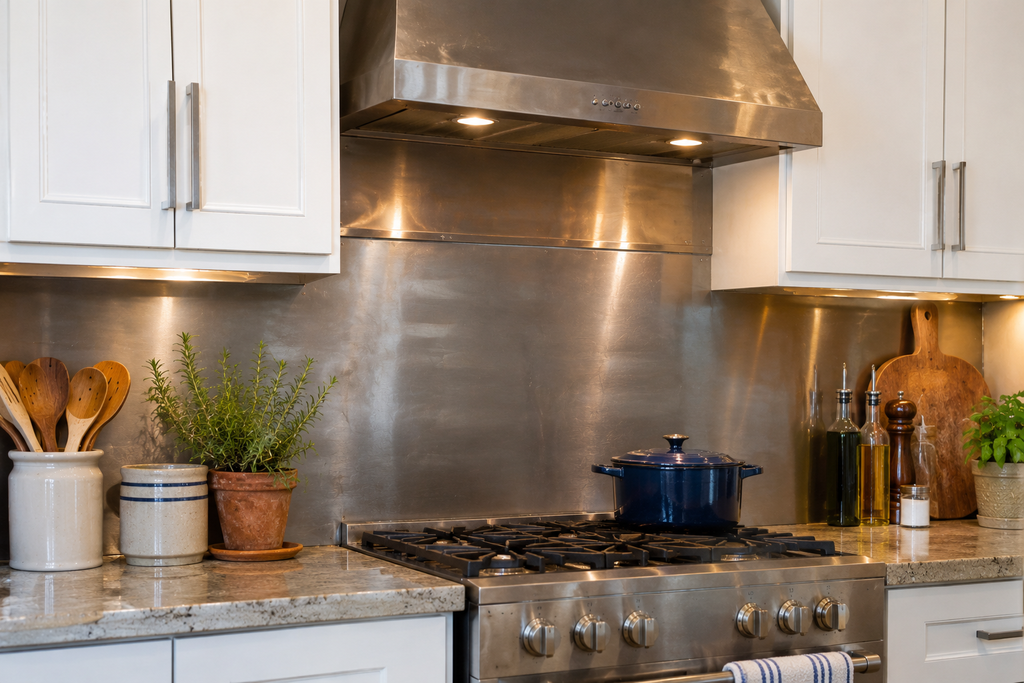
Metal backsplashes suit rustic and industrial-leaning farmhouse kitchens, especially behind the range, where they handle heat that would ruin other materials.
Stainless steel is non-combustible, hygienic, and common in commercial kitchens. A brushed finish hides scratches better than a mirror finish, though fingerprints will show on either. A stainless panel behind the range with tile elsewhere is a common compromise.
Copper is warmer. Unlacquered copper darkens and develops a patina, and it can show marks from acidic splashes, which some people find charming and others find frustrating. Lacquered copper stays brighter but the coating can wear or discolor over time. A hammered texture hides fingerprints and small marks well. Copper-look porcelain tiles give a similar glow without the maintenance.
Either metal is installed as sheet, so the cut needs to be precise, especially around outlets. Edges can be sharp, so wear gloves and consider having a fabricator cut and finish the panels. Where the metal meets other materials, a trim piece creates a clean edge.
A Quick Way to Match Ideas to Your Kitchen
| Kitchen style | Strongest fits | Why |
| White cabinets | 1, 2, 5, 7, 8, 10 | Contrast, veining, or color adds interest to an otherwise plain base |
| Farmhouse | 1, 2, 3, 8, 10 | Handmade texture, painted wood, and soft color suit the style |
| Rustic | 4, 6 (in brick or wood-look), 9, 11 | Raw, textured, natural materials carry the look |
Details That Decide How a Backsplash Ages
Caulk, don’t grout, where tile meets the countertop. Those joints move slightly with temperature and humidity. Grout can crack there, while flexible caulk in a matching color holds up better.
Choose grout deliberately. Cement-based grout is common and affordable but needs sealing in a kitchen. Epoxy grout resists stains and holds color but is harder to apply. Joints narrower than about 1/8 inch usually take unsanded grout, and wider joints take sanded grout. Check the tile and grout manufacturers’ instructions, and follow the cure window they specify before sealing.
Handle outlets with care. Tile and stone thicken the wall, which can leave outlet boxes sitting too far back. Box extenders fix this, and they’re inexpensive. Electrical code has rules about how far a box may sit from the finished surface, and those rules differ for combustible and non-combustible wall coverings. Kitchen countertop receptacles also generally require GFCI protection. Turn off power at the breaker before touching an outlet, and bring in a licensed electrician if you aren’t sure.
Test before you demolish. In older homes, adhesives and wallboard from before the 1980s may contain asbestos, and old paint may contain lead. If your house is that old, have the materials tested before tearing out an existing backsplash.
Keep leftovers. Tile from different production lots can vary slightly in color. Order everything at once, plus extra for cuts and future repairs.
Renting, or Working With a Small Budget
Peel-and-stick tiles are the realistic option for renters or very tight budgets. They install over a clean, smooth wall and can be removed more easily than ceramic. Check the product’s heat rating, and don’t install them directly behind a gas range or cooktop without the manufacturer’s approval. Use a metal or tile panel behind the cooking area and peel-and-stick everywhere else. Textured or poorly prepped walls cause lifting at the seams, so clean and smooth the surface first.
Questions People Genuinely Ask
Can I tile over an existing backsplash?
Sometimes. The old surface needs to be firmly attached, flat, clean, and lightly roughened so new adhesive can bond. Loose tile, peeling wallpaper, or a glossy surface that can’t be abraded needs removal. Added thickness will also push outlets out of position, so factor in box extenders. Check the adhesive manufacturer’s instructions for what they allow.
Should grout match the tile or contrast with it?
Matching grout makes the wall look continuous and quiet, which suits busy patterns like herringbone or zellige. Contrasting grout outlines every tile and turns the layout into a design feature, which works for simple tile such as subway but can look busy with complicated shapes. When in doubt, go one shade off the tile color.
Do all backsplash materials need sealing?
No. Glazed ceramic and porcelain tile generally don’t, though the grout between them usually does. Natural stone, cement tile, brick, and cement-based grout typically do. Each manufacturer’s instructions control the sealer type and schedule.
How much extra tile should I order?
Ten percent over your measured area is a common rule for straight layouts. Diagonal and herringbone layouts need more, often 15 to 20 percent. Ask your installer, and buy a little extra beyond that for future repairs.
Key Takeaways
Pick the wall’s hardest job first. Heat and grease behind the range rule out wood, MDF, and most plastics. Water near the sink rules out unsealed stone and untreated wood. Once that’s settled, the choice becomes about style.
Then give the kitchen one hero. If the countertop has strong veining, choose a quiet tile like white subway or zellige. If the countertop is plain, a patterned panel, a muted color, or brick can take the lead.
Before ordering, tape two or three samples beside your actual cabinets and leave them up for several days. Check them in morning light, evening light, and under your own bulbs. Read your range’s installation manual for clearance rules, and ask your installer about waste, grout, and outlets. Those decisions matter as much as the tile does.

About Syprose Kiche
Syprose Kiche is the creator and writer behind My Besuited Home, a practical home and garden website covering DIY projects, gardening, lawn care, landscaping, home improvement, and outdoor living. She focuses on turning everyday homeowner questions into clear, practical guides backed by careful research and useful real-world considerations.