

I’ve always believed that small living rooms are the best places to take the biggest risks. While the rest of the world is obsessing over “sad beige” minimalism, there’s something rebellious and deeply cozy about lean-ing into a color as unapologetic as cherry red. It’s a shade that carries a certain pulse; it’s the color of a classic lipstick, a vintage sports car, and that perfect corner booth in a French bistro.
People often warn against using bold colors in tight quarters, fearing the walls will “close in.” But in my experience, a small room with no personality feels much smaller than one that embraces its boundaries with confidence. Cherry red doesn’t just sit there; it creates an atmosphere. It’s about shifting the focus from the square footage to the mood of the room.
If you’ve been staring at your four white walls feeling like something is missing, you’re in the right place. We’re going to look at how to use this high-octane hue to make your space feel curated and expensive rather than chaotic. Here are eleven ways to invite cherry red into your home without it taking over your life.
1. The Statement Accent Wall
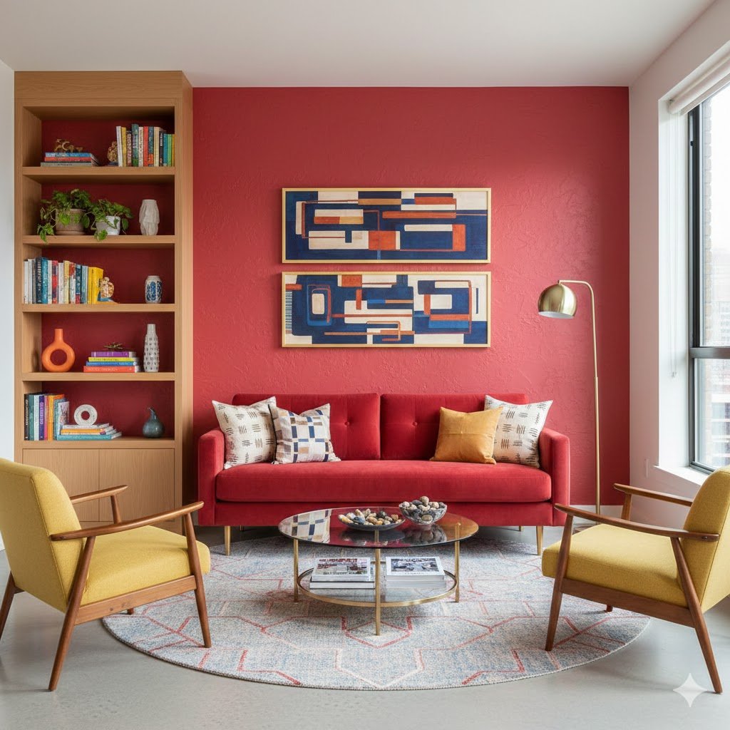
I used to be a skeptic of the accent wall, thinking it felt a bit like a “safe” compromise. Then I saw a tiny studio apartment where the wall behind the sofa was painted a deep, glossy cherry. It didn’t make the room look smaller; it gave the room a soul. By choosing the shortest wall or the one with the most natural light, you create a focal point that anchors the entire layout.
The trick to making this work in a small space is the “boundary” color. If your other three walls are a crisp, gallery white, the red wall feels like a piece of art rather than a heavy weight. It provides a sense of depth, almost like a stage set, which actually pushes the visual boundaries of the room further back than a flat neutral would.
When you go this route, try to keep the furniture in front of that wall relatively simple. A light gray or tan sofa against a cherry backdrop looks sophisticated and intentional. It’s that contrast that keeps the room feeling “airy.” You aren’t just painting a wall; you’re creating a mood that says you aren’t afraid of your own taste.
2. The Monochromatic Texture Play
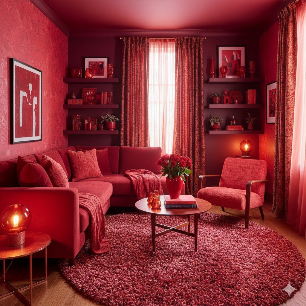
One of the biggest mistakes people make with red is sticking to one flat finish. If everything is the same matte cherry, the room starts to look like a cartoon. I’ve found that the secret to a successful red-on-red look is a heavy emphasis on texture. Think a cherry red wool throw draped over a corduroy chair, sitting on a plush, low-pile rug.
In a small space, this layering creates a “jewel box” effect. Because the colors are in the same family, your eyes don’t get tripped up by high-contrast jumps, which can make a room feel cluttered. Instead, the eye glides over the different surfaces—the sheen of a silk pillow next to the rough weave of a linen cushion. It’s a sensory experience that feels incredibly high-end.
To keep this from feeling like an accidental Valentine’s Day explosion, vary the “temperatures” of your reds. Mix a slightly cooler, blue-toned cherry with a deeper, brick-leaning red. This subtle shift in tone adds the kind of architectural dimension that small rooms usually lack. It’s a sophisticated way to play with a “big” color without it feeling overwhelming.
3. Cherry Red Built-ins
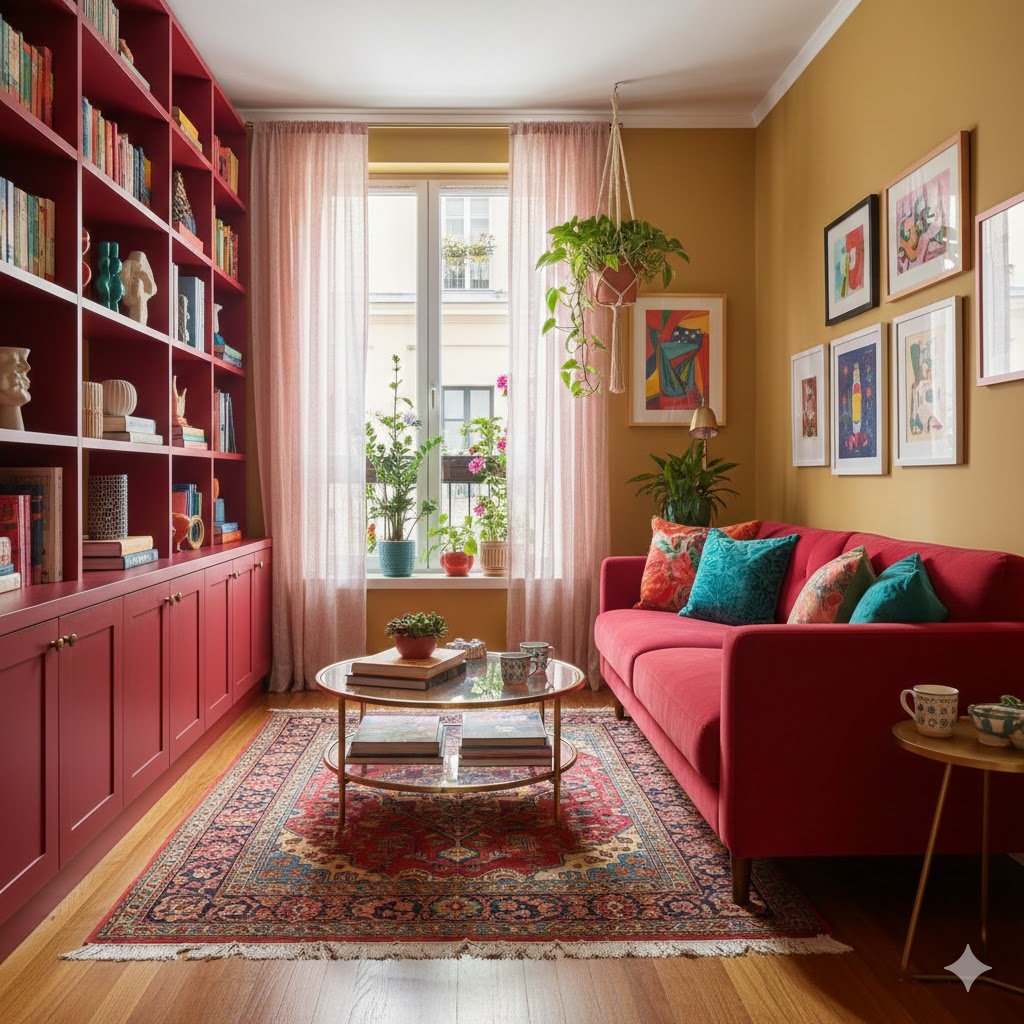
There is something undeniably “library-chic” about painting built-in shelving a bold color. If you have those standard white IKEA Billy bookcases or actual architectural built-ins, painting them cherry red transforms them into a custom feature. In a small living room, furniture that matches or complements the wall color can actually make the room feel less crowded because the pieces don’t “jump out” at you.
I love the idea of painting the inside backs of the shelves a shade darker than the frame. This creates a shadow effect that makes your books and objects pop. It turns your storage into a curated display. When the shelving unit is red, the items on it—your green plants, gold frames, or white ceramic vases—suddenly look like they were styled by a professional.
This approach also helps solve the problem of “visual noise.” In a small room, dozens of colorful book spines can look messy. But when they are housed within a strong, singular color like cherry red, the shelves feel like one cohesive unit. It’s a clever design trick that manages chaos while adding a massive dose of personality to the room.
4. The Velvet Compact Sofa

If you’re only going to do one big thing, make it the sofa. A cherry red velvet loveseat is the ultimate “small space” power move. Velvet is a magical fabric for red because it catches the light and creates highlights and shadows naturally. It never looks like one flat block of color; it looks like a living, breathing part of the room.
In a small living area, a bold sofa acts as a North Star. Everything else in the room can be completely neutral—natural wood, white walls, jute rugs—and the room will still feel finished because of that one piece. It tells people exactly where to look and where to sit. It’s a confident choice that makes the small footprint of the room feel like an intentional design decision rather than a limitation.
I always recommend going for a sofa with “legs”—meaning you can see the floor underneath it. When you have a heavy color like cherry red, keeping the silhouette of the furniture light and lifted prevents the room from feeling weighed down. It’s that balance of a heavy, rich color with a light, airy shape that creates the perfect modern aesthetic.
5. Strategic Rug Placement
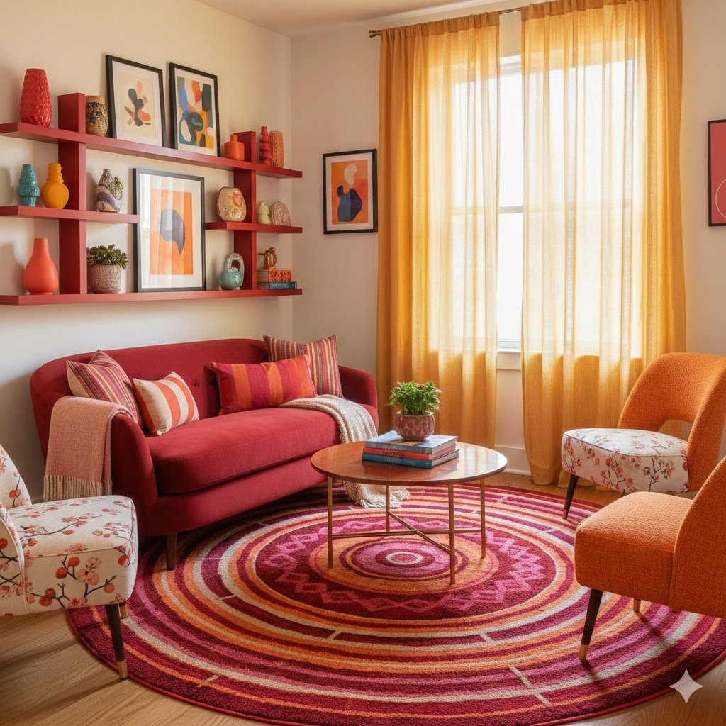
Rugs are the most underutilized tools for color. A rug with cherry red as its primary or secondary color can “ground” a seating arrangement in a way that paint simply can’t. I’m a huge fan of traditional Persian or Turkish rugs for this. They often feature red as a base, but it’s broken up by intricate patterns in cream, navy, or gold, which softens the impact of the red.
In a small room, a rug defines the boundaries of the “living” zone. If you have an open-concept studio, a red rug says, “This is the lounge,” without needing walls to prove it. The complexity of a patterned rug also hides life’s little messes much better than a solid color would, which is always a plus in high-traffic small spaces.
Don’t be afraid to go big with the rug size. A common mistake is buying a tiny rug that floats in the middle of the floor like a postage stamp. By choosing a larger rug that sits under the front legs of your furniture, you expand the visual field. The cherry red becomes a warm foundation that makes the whole room feel like a cozy, unified sanctuary.
6. High-Gloss Finishes
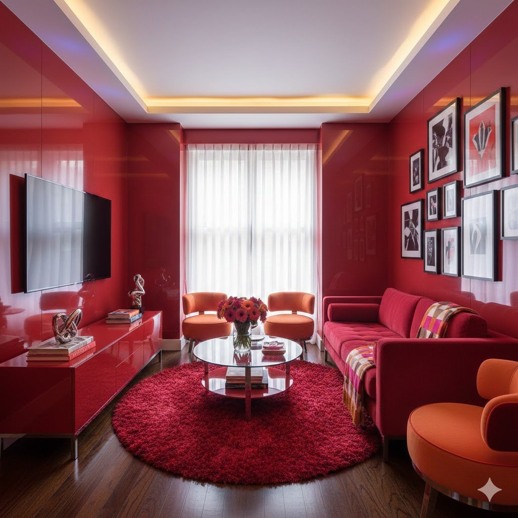
I’m a firm believer that every small room needs a little bit of shine to bounce light around. A high-gloss cherry red coffee table or a pair of lacquered side chairs can act like jewelry for your living room. The reflective surface prevents the red from feeling “flat” or “heavy.” Instead, it catches the glow from lamps and windows, adding a sense of movement.
Think about a classic red lacquer tray or a sleek, mid-century modern side table. These pieces bring in a “pop” of color that feels intentional and sharp. In a small space, these glossy surfaces are practical, too—they are usually easy to clean and their reflective nature mimics the effect of a mirror, helping the room feel a bit more expansive.
If you’re feeling crafty, you can even upcycle an old wooden piece with high-gloss spray paint. It’s an inexpensive way to test out the cherry red trend. You’ll find that the way the light hits a curved, glossy red surface adds a level of sophistication that matte finishes just can’t touch. It’s the difference between a dull brick and a polished ruby.
7. Floor-to-Ceiling Drapes
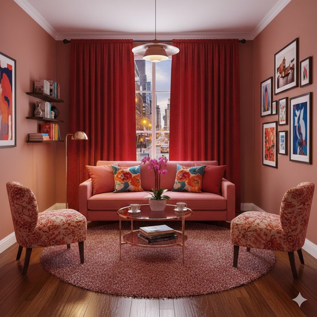
Height is your best friend when you’re working with limited square footage. One of my favorite tricks is hanging cherry red drapes as high as possible—literally touching the ceiling—and letting them hit the floor. This draws the eye upward, making the ceilings feel much higher than they actually are. It’s a vertical streak of color that commands attention.
When the sun shines through red curtains, it casts a warm, rosy glow over the entire room. It’s like living inside a permanent sunset. It makes the light in the room feel “expensive” and soft. Even if the rest of your decor is fairly standard, the drama of heavy, floor-length red fabric creates a sense of luxury and “grandeur” that belies the small size of the space.
For a smaller room, I suggest choosing a fabric with some weight, like a heavy linen or a light velvet. You want them to hang straight and look architectural. If you’re worried about it being too much red, you can use a double rod and put a sheer white curtain behind the red ones. This allows you to pull the red drapes back during the day to frame the window with a bold “stripe” of color.
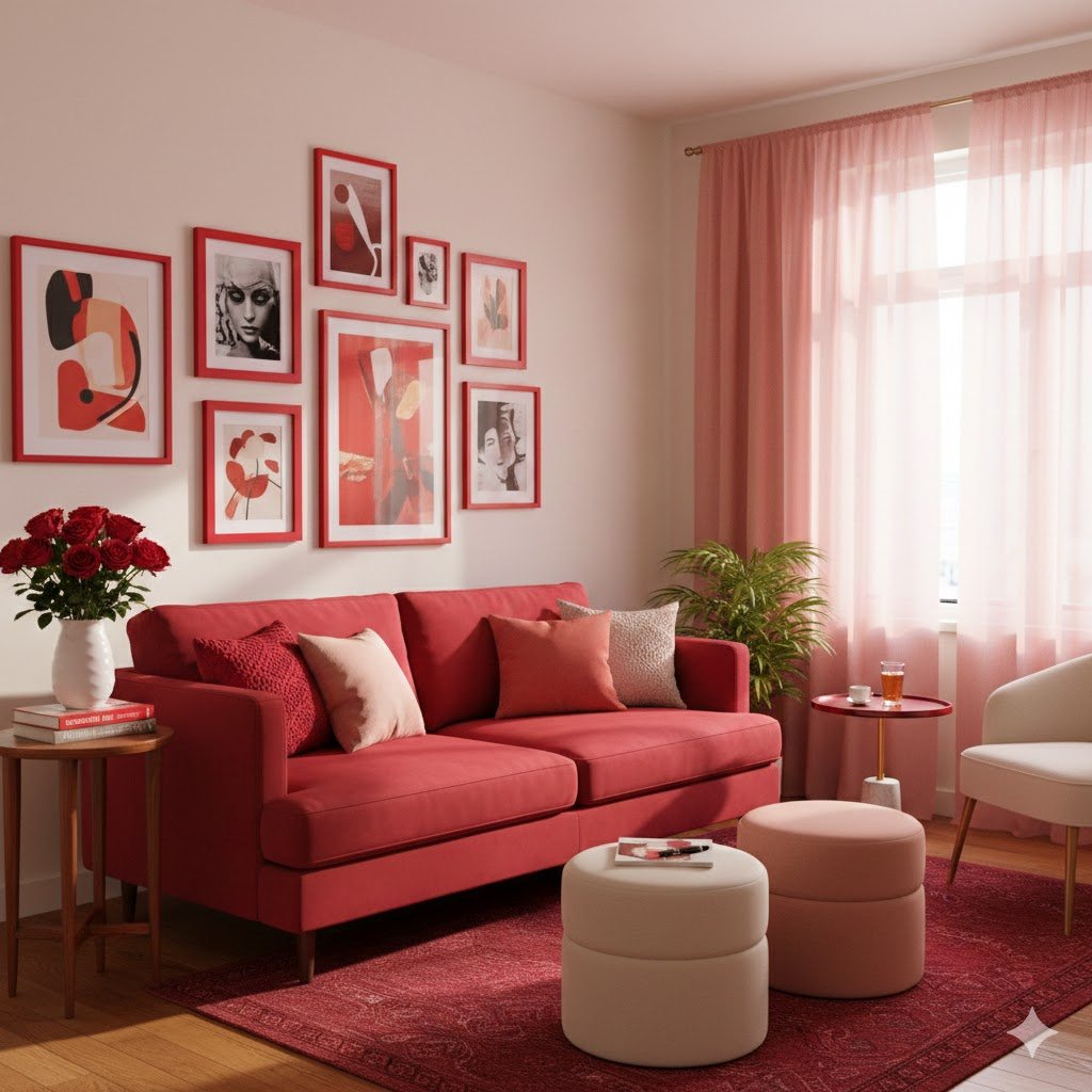
8. Gallery Wall with Red Frames

Sometimes, the best way to introduce a bold color is through repetition in small doses. I love the look of a gallery wall where every single frame is painted the exact same shade of cherry red. It’s a way to unify a bunch of different art pieces—photos, postcards, sketches—into one cohesive “moment.”
In a small room, a gallery wall can sometimes feel cluttered. But by using a singular, vibrant frame color, you create a visual grid that feels organized. The red frames act as a “border” for your eyes, making the wall look like a singular installation rather than a collection of small items. It adds a punch of color at eye level, which is where you want the energy to be.
You don’t even need expensive art for this. Even simple black-and-white line drawings or old family photos look incredibly modern when encased in cherry red. It’s a “low-stakes” way to play with the color. If you decide you want to change things up in a year, it’s a lot easier to swap out frames than it is to repaint the whole room.
9. The “Pop” of Lighting

Lighting is often the “forgotten” design element, but a cherry red lamp is a total game-changer. Whether it’s a sleek, metal floor lamp or a vintage-style ceramic table lamp, a red light fixture acts as a functional sculpture. It’s a way to bring the color into the middle of the room or a dark corner where it’s most needed.
I think red lighting works best when it’s a bit unexpected. A cherry red pendant light hanging over a coffee table in a small apartment creates a “zone” of intimacy. It’s a bit retro, a bit industrial, and entirely cool. When the lamp is off, it’s a bold sculptural piece; when it’s on, the red base or shade adds a warmth to the light that makes the room feel incredibly inviting.
Don’t overthink this one. A single red task lamp on a side table can be enough to tie a whole room together. It’s about that one “red thread” that connects your decor choices. In a small space, you don’t need much to make a statement, and a well-placed, brightly colored lamp is often the most effective “less is more” move you can make.
10. Nature-Inspired Red
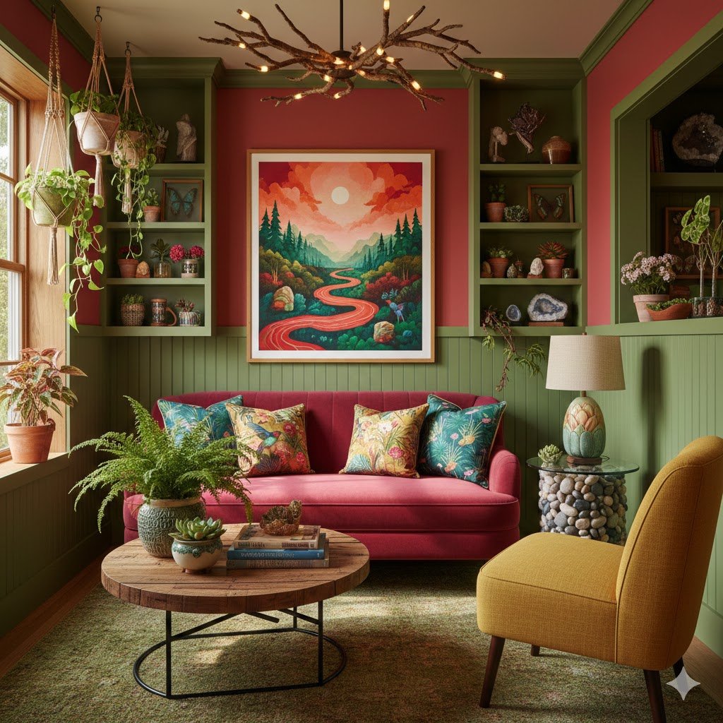
If you’re a bit color-shy, you can look to nature for your cherry red inspiration. This can mean anything from a large, vibrant arrangement of red berries or poppies to choosing furniture made of cherry wood. Natural reds have a built-in warmth and “earthiness” that keeps the color from feeling too synthetic or overwhelming in a tight space.
I love using plants with red variegated leaves or even just a simple red clay pot to introduce the hue. These organic elements bring a “softness” to the color. It’s less about a “design statement” and more about an organic feeling of warmth. It’s a great way to “test drive” the color in your living room to see how the light interacts with it throughout the day.
Even something as simple as a wooden bowl made of cherry wood or a piece of red coral on a bookshelf can provide that “pop.” These textures feel grounded. In a small living room, bringing in natural elements helps the space feel less like a “box” and more like an extension of the outside world, which is a great psychological trick for making a space feel larger.
11. Two-Tone Walls (The Chair Rail Trick)
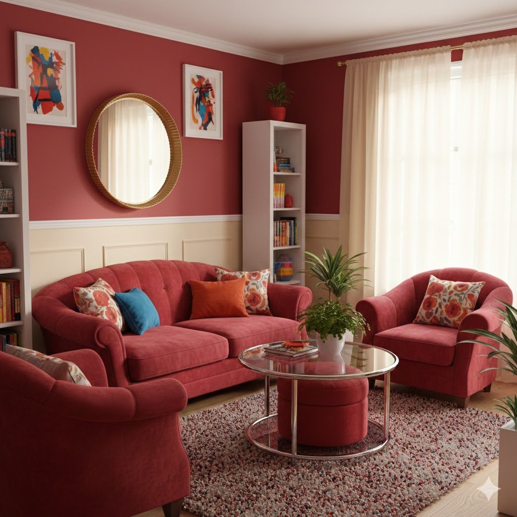
This is a classic design move that works wonders in small, old apartments. By painting the bottom third of the wall cherry red and the top two-thirds a light neutral (like cream or pale gray), you get the drama of the color without the “closing in” effect. The red “grounds” the room, while the lighter color above keeps the ceiling feeling high and the air circulating.
You don’t even need a physical chair rail to do this; a clean line of painter’s tape will do the trick. It creates a horizontal line that actually leads the eye around the perimeter of the room, making the space feel wider. It’s a clever bit of visual architecture that adds interest to flat, boring walls.
I’ve seen this done with a cherry red base and a very light, almost-white pink on top. The result is sophisticated, tonal, and incredibly cozy. It’s a way to use red that feels “settled” rather than “loud.” It’s perfect for small living rooms that also serve as home offices or dining areas, as it defines the lower half of the room where you actually live and sit.
Wrap-Up
Designing a small living room isn’t about following a set of “small space rules” that leave you with a boring, beige box. It’s about creating a place that feels like you. Cherry red is a brave choice, but it’s also one that pays off in warmth, energy, and a sense of “home.” Whether you go all-in with a velvet sofa or just start with a few lacquered frames, you’re giving your space a heartbeat.
The most important thing to remember is that you’re the one who has to live there. If a color makes you feel happy and energized, it doesn’t matter what the square footage is. So, grab a paintbrush or find that perfect rug—your small space is ready for its big red moment.